Typography, for instance
Typography is the visual component of the written word.
-Matthew Butterick
It feels so good to read text visualized and displayed through good typography.
Books, magazines, websites, apps, user interfaces come alive with the right typefaces. I find Butterick’s Practical Typography and Typography for Lawyers very helpful.
I have three guidelines when choosing typefaces / fonts for my work:
- They should be easy to read on screen and on paper.
- They should fit the project’s purpose and aesthetic.
- I should enjoy looking at the text displayed through the font.
Analog roots
I also like how some of the vocabulary for typography comes from the days of the printing press. For instance:
Leading - distance between lines of text. Typesetters once relied on lead strips to maintain even spacing between lines. It’s nice how the term points to the history of type.
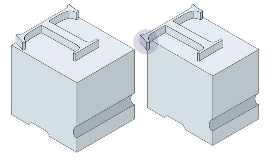
Kerning - the horizontal space between characters. Kern used to refer to the portion of metal type that hung over a metal character block (see image below). With a portion hanging over the block, the printed character would be closer to next one. Kern now refers to the actual spacing between characters.

Attribution: Metal_type.svg: User:Booyabazooka, User:Jenson derivative work: Rick Yorgason, Public domain, via Wikimedia Commons
Do you enjoy typography? What are your favorite typefaces and/or fonts for screens?
-Law Aritao


